RevDeBug
Transforming complexity into usability of a flight recorder tool for reverse debugging.
Project Overview
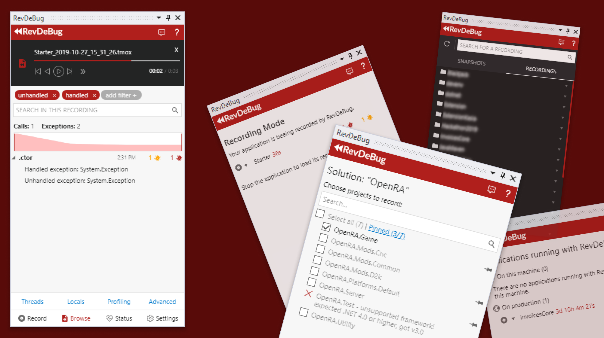
As the sole product designer at RevDeBug, I was tasked with revitalizing our Visual Studio extension panel. This case study outlines how I approached the challenge of transforming a complex, developer-focused tool into an intuitive, user-friendly interface.
Tools: HTML5, XAML, SCSS, Gimp, Git, JavaScript, jQuery
The Challenge
RevDeBug, originally an internal tool created by backend developers, faced significant usability issues when it became available worldwide. The main challenges were:
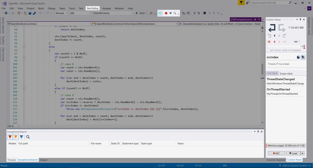
- Poor discoverability of the newly installed extension within Visual Studio
- Scattered functionality across the interface
- A complex, multi-step process to access the main feature
My Role
As the sole designer, I was responsible for:
- Initial design and ideation
- User research and interviews
- UX design and iteration
- Frontend development
- Collaboration with backend developers and managers
The Process
1. Research and Discovery
To address the issues, I conducted:
- User interviews to understand pain points and needs
- Usability tests of the existing interface
- Analysis of user feedback and behavior patterns
2. Initial Simplification
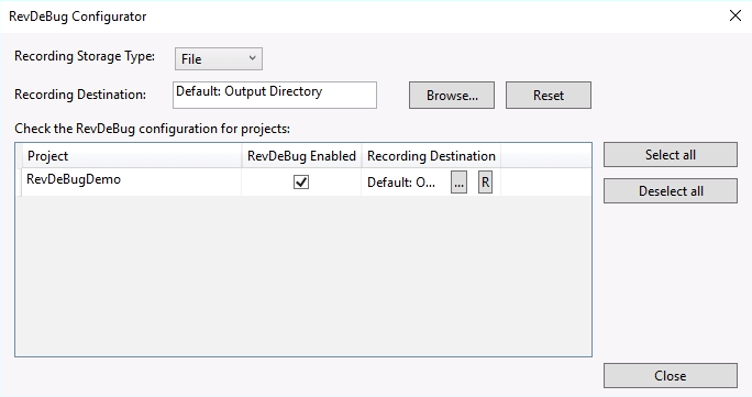
We developed a “3 steps to get a recording” concept to streamline the user journey.


3. Major UX/UI Overhaul (Version 4.0)
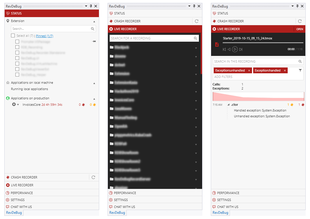
I created an accordion-style interface, which allowed for better information organization and guided user interaction.
4. Continuous Improvement
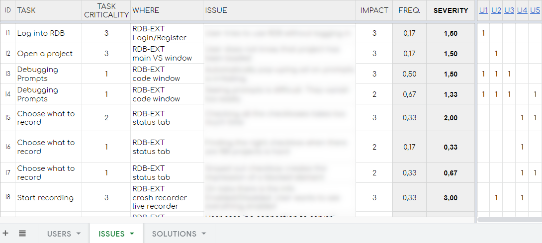
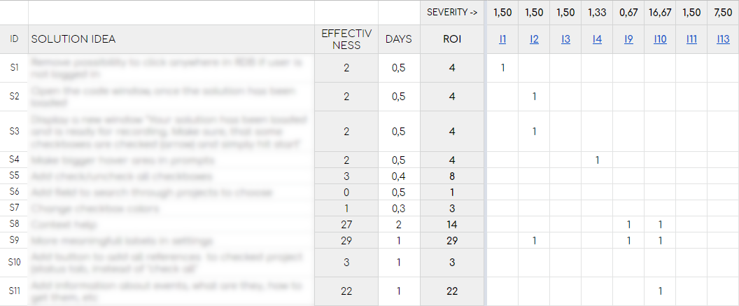
After the 4.0 release, I conducted further user testing and identified remaining issues. I categorized these issues by severity and developed targeted solutions.
5. Final Redesign
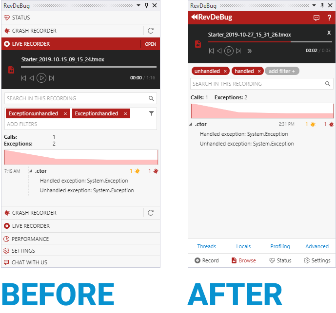
Based on user insights, I proposed a new design that:
- Consolidated all functionalities into the right panel
- Replaced the accordion with clear action-based navigation
- Simplified the interface by removing non-essential elements
- Reorganized information to align with user goals and workflows
Key Design Decisions
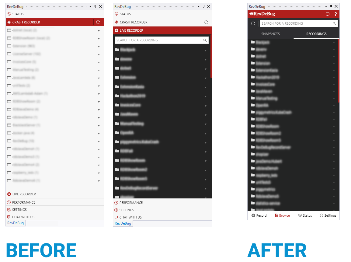
- Created a clear three-action navigation: Record, Load, and Check Status
- Separated the solution status from the overall application status
- Combined “Crash recorder” and “Live recorder” into a single “Browse” window
- Improved the visibility and accessibility of detailed windows and filtering options
- Added informative in-between views to keep users updated on ongoing processes
Outcomes and Impact
While still in the internal testing phase, the redesign has shown promising results:
- Increased user comprehension of the interface
- Higher user satisfaction and preference over the older version
- Improved discoverability of key features
Key Learnings
This project reinforced the importance of:
- Continuous user testing and feedback incorporation
- Balancing power-user features with intuitive design for new users
- Aligning interface design with user goals and mental models
- Iterative design process in complex technical environments
Conclusion
The RevDeBug Visual Studio Panel redesign demonstrates how a complex, technical tool can be transformed into a more accessible and user-friendly interface through iterative design and user-centered thinking. As the sole product designer, this project showcased my ability to tackle complex UX challenges independently, collaborate with cross-functional teams, and deliver impactful design solutions that meet both user needs and business objectives.